Our Website Design Portfolio
Creative Design. Intuitive Feel. Built To Generate Sales.
Featured Website Redesign Project – Before
The Old Website
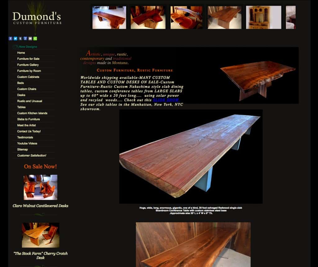
This is the original website design that Dumond’s Custom Furniture had when we started working with them back in 2016. You can see that it looks a bit outdated and rightfully so as it was built several years previous. But besides the outdated look, there were a number of things that needed to be changed on this website.
Non-Intuitive User Experience
The content that you see when you first land on this page looks all scattered about and has no real order or flow. This causes users to bounce around trying to find what they are looking for.
Lacking Clear Calls To Action
There was no clear way for a website visitor to reach the business. The business’s phone number, in particular, couldn’t be found without scrolling down the page or clicking through to the contact page. Having contact information prominently displayed at the top of your website will greatly boost conversions.
Featured Website Redesign Project – After
The New Website
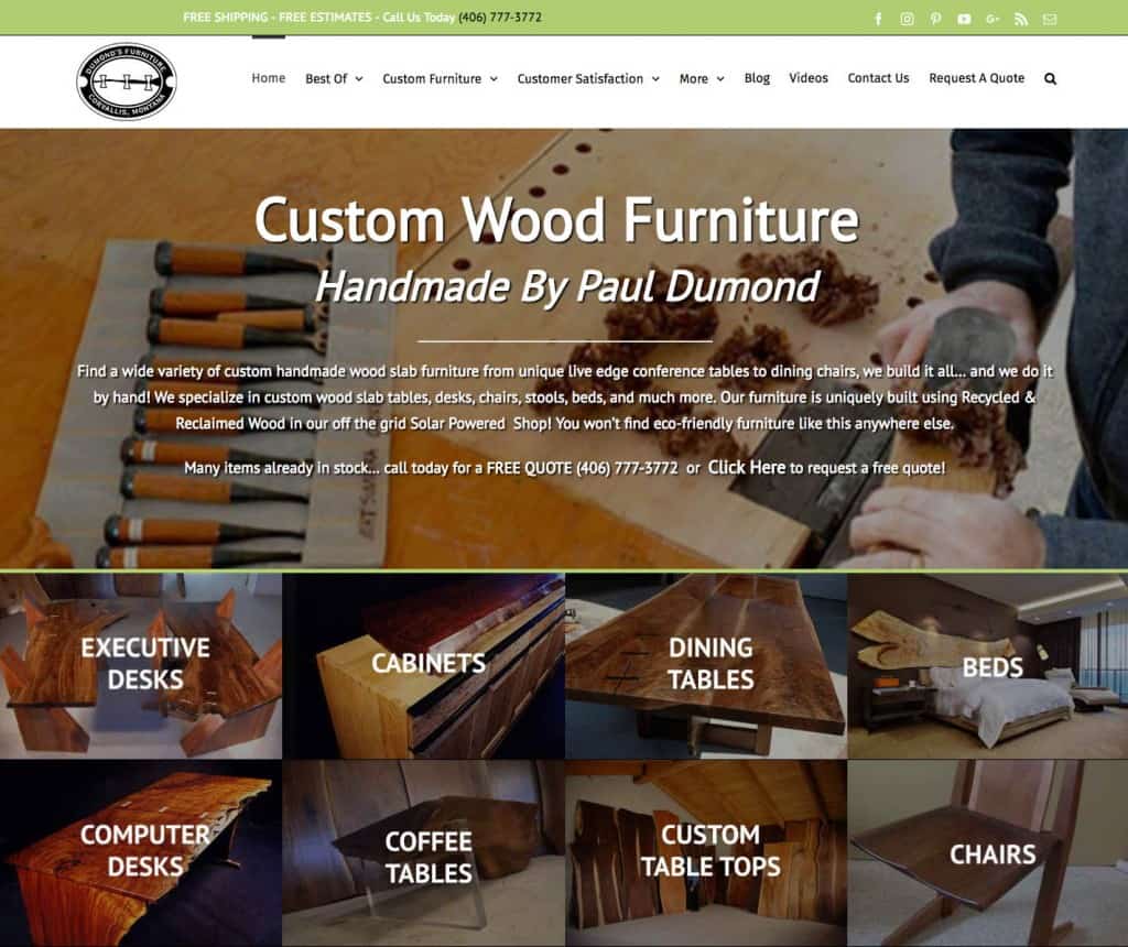
Right away you can see the difference that an up to date layout can make. This website looks much more inviting than the previous design but we also changed a lot of things to improve conversion rates.
Intuitive User Experience
The second you land on this page you are introduced to some clearly defined sections within the website such as Dining Tables, Executive Desks, etc. which makes it easy for people to find exactly what they are looking for.
Clear Calls To Action
The new version of the website also features a prominently displayed call to action at the very top of the website. It mentions free shipping and then presents a phone number that can actually be clicked to call on mobile devices. This is a huge upgrade from their previous positioning.
Some Of Our Recent Web Design Projects
